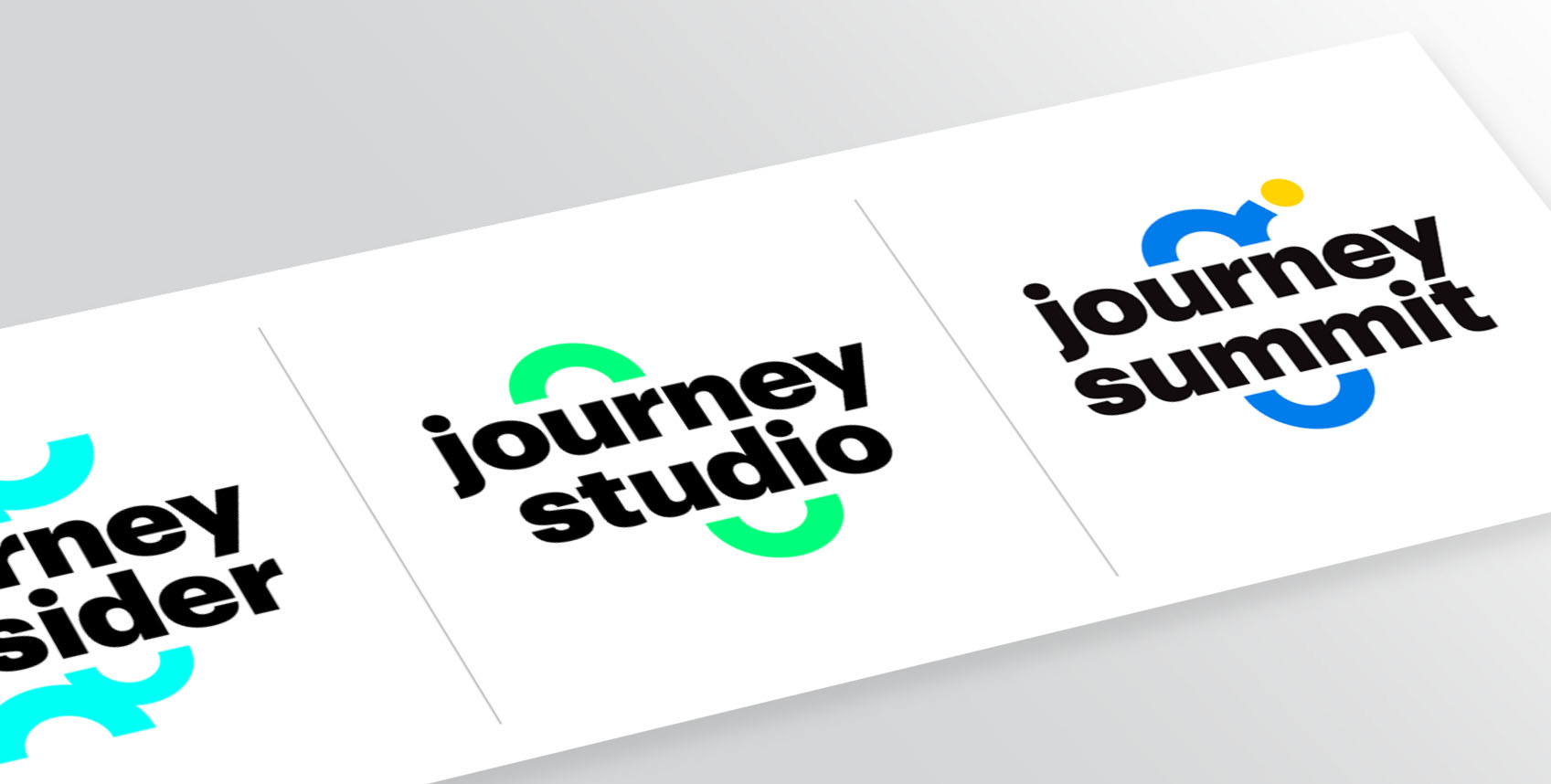
I was tasked with giving a new, cohesive identity to illumin’s sub-brands. One is a podcast, and two are in-person events, but all of them centre around the concept of “journey” (relative to the marketing of the illumin product). I chose to keep clean, bold typography for them, with the focus being on the “paths” surrounding the logos being symbolic of a journey. These paths could then also be used as graphic symbols on their own.


